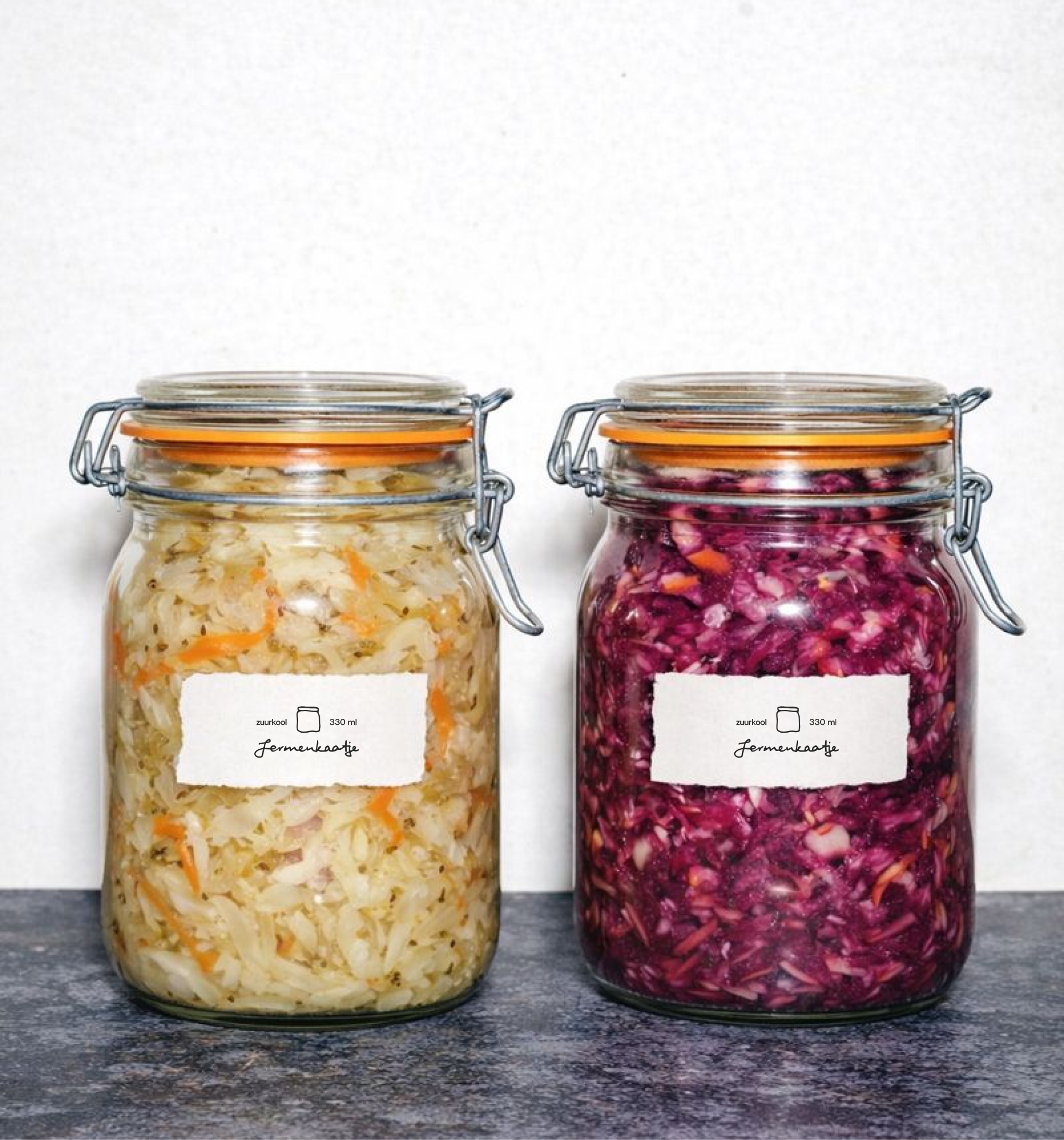
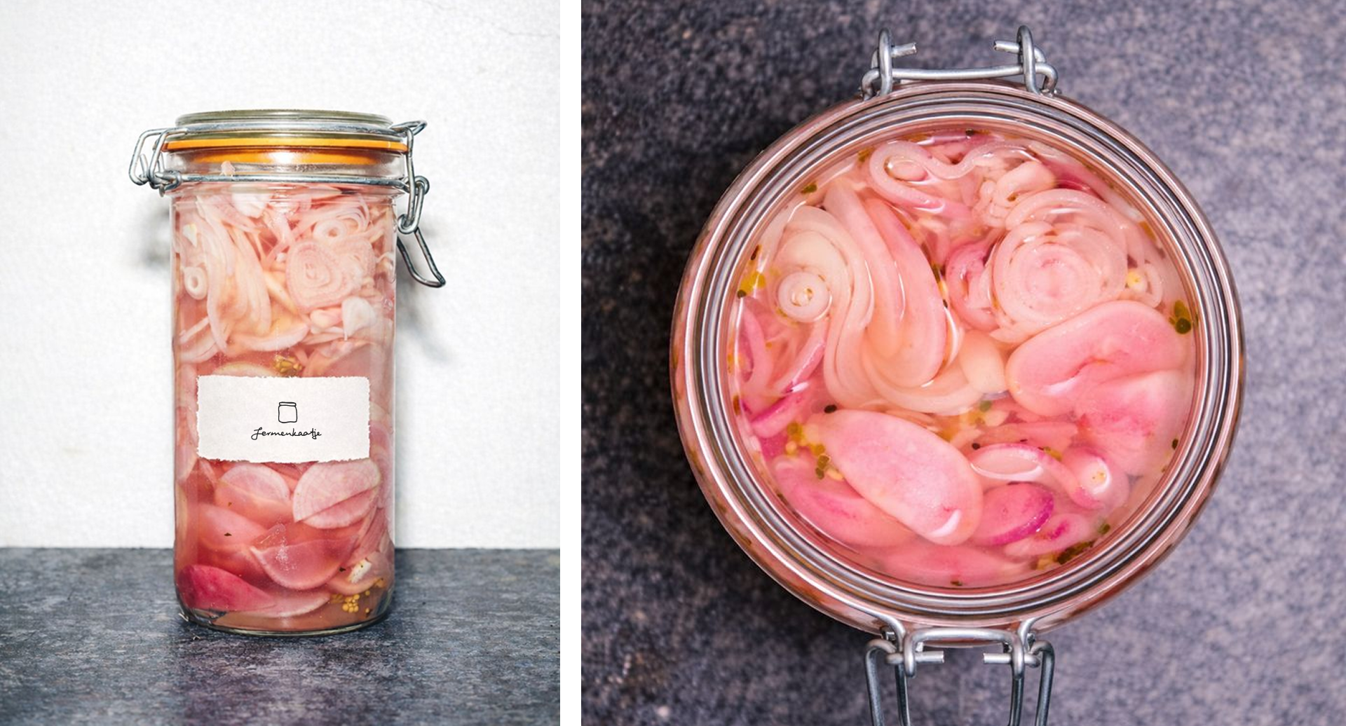
Fermenkaatje
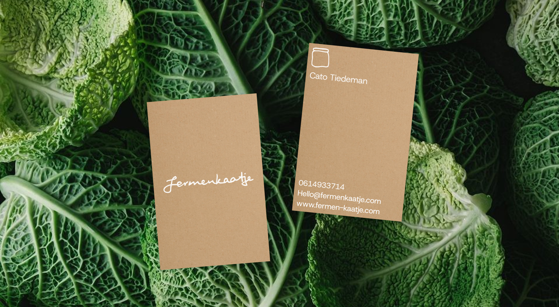
For Fermenkaatje, I created a logo rooted in simplicity, craft, and authenticity. Fermentation is about returning to the essentials, and that idea became the foundation of the logo design.
The handwritten wordmark reflects the human, intuitive nature of the process, while the stamped jar illustration refers to tradition, preservation, and care. Together, they form a mark that feels honest and tactile, imperfect in a way that feels real. The identity mirrors Fermenkaatje’s philosophy: food made slowly, locally, and with attention, letting nature do the work.
Brief
Create a logo
Scope
Concept Development / Logo design
Client
Fermenkaatje
Date
November 2025
Create a logo
Scope
Concept Development / Logo design
Client
Fermenkaatje
Date
November 2025

Design Principles
We created design principles to guide our decisions and keep our brand at the center of everything we do.
Organic
Pure products from local farmers.
Fundamental
A return to the essence of food and basic ingredients.
Crafted
Made with care by people and by nature.
We created design principles to guide our decisions and keep our brand at the center of everything we do.
Organic
Pure products from local farmers.
Fundamental
A return to the essence of food and basic ingredients.
Crafted
Made with care by people and by nature.

Manifesto
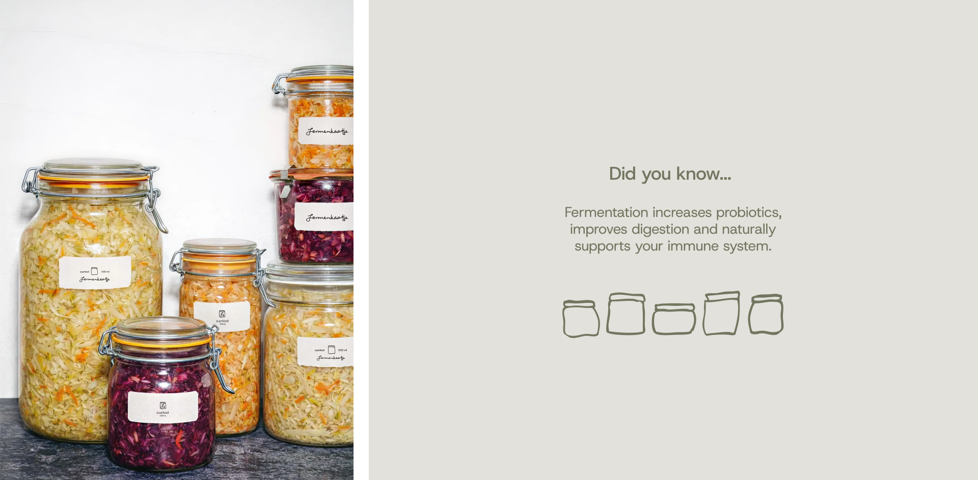
At Fermenkaatje, we believe that real food starts at the basics. Fermentation isn’t a trend for us, it’s a way to return to what’s good for your health, for nature, and for taste. We work with local ingredients, give our products the time they need, and let nature do the work. No preservatives. No rush. We want to show how simple good food can be, and how delicious something tastes when it’s made with care.
At Fermenkaatje, we believe that real food starts at the basics. Fermentation isn’t a trend for us, it’s a way to return to what’s good for your health, for nature, and for taste. We work with local ingredients, give our products the time they need, and let nature do the work. No preservatives. No rush. We want to show how simple good food can be, and how delicious something tastes when it’s made with care.