FESTIVAL NO. 6
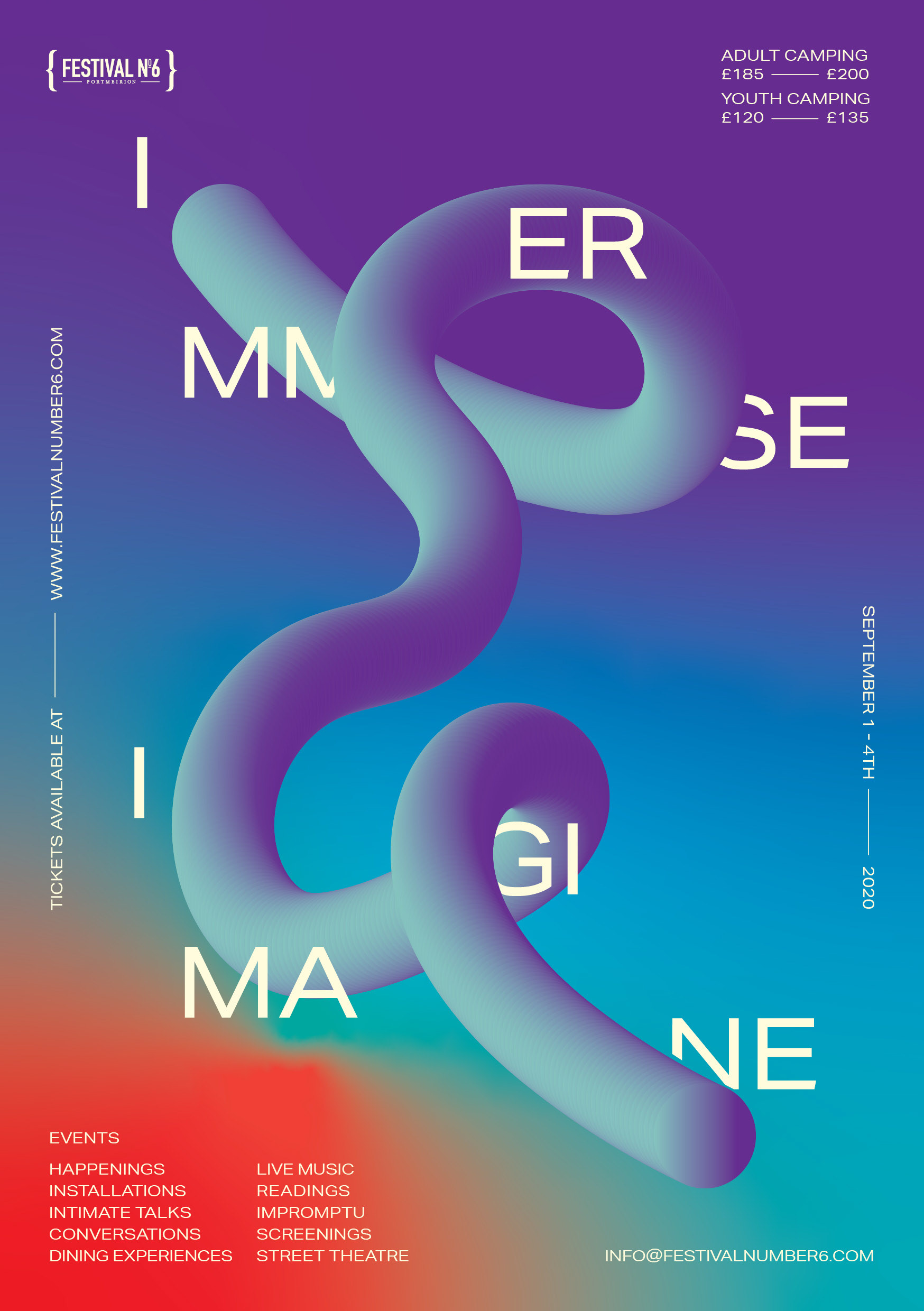
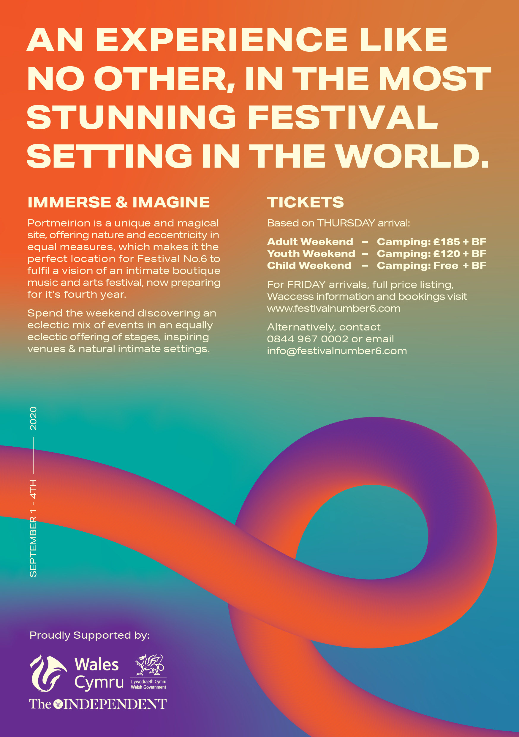
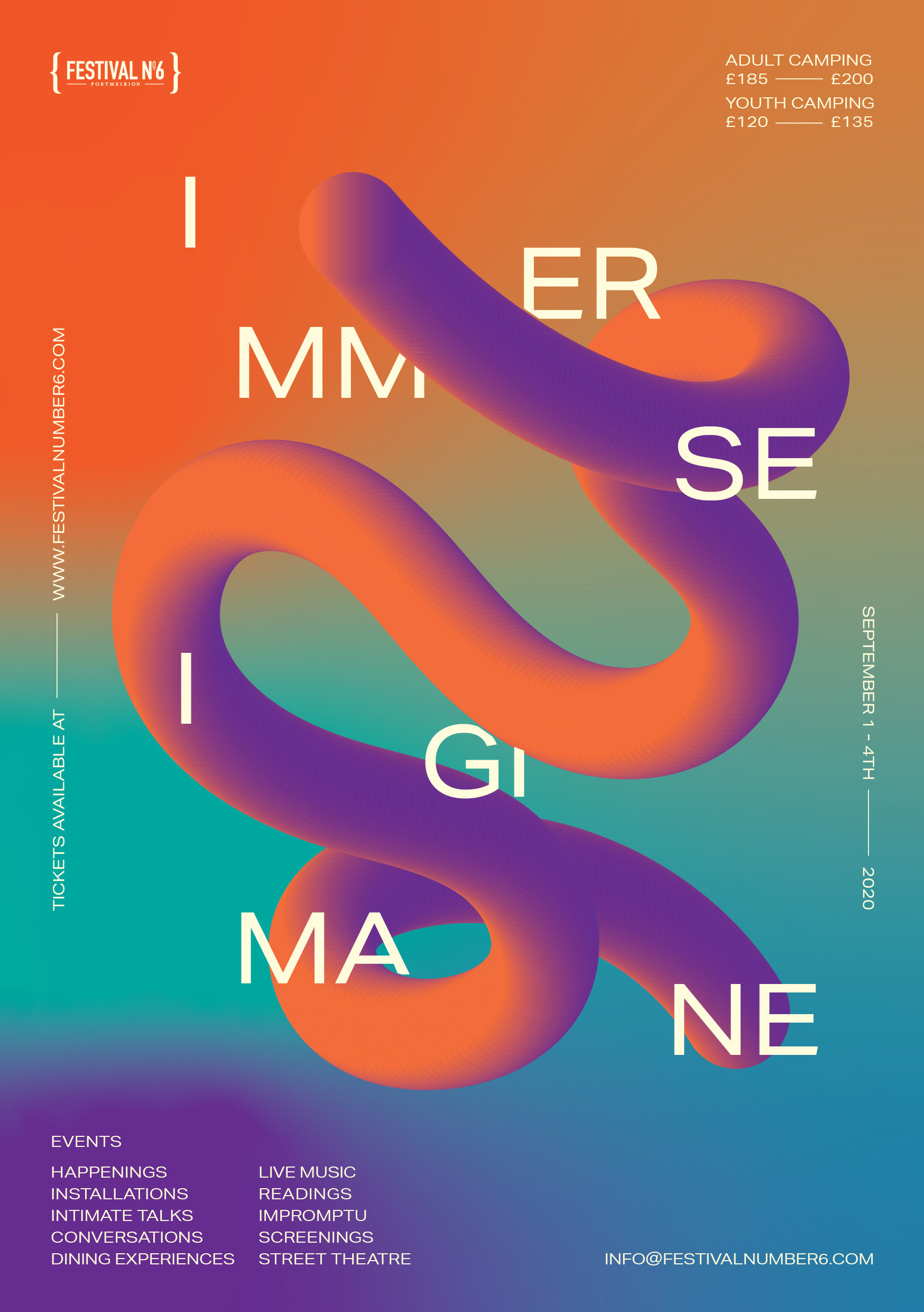
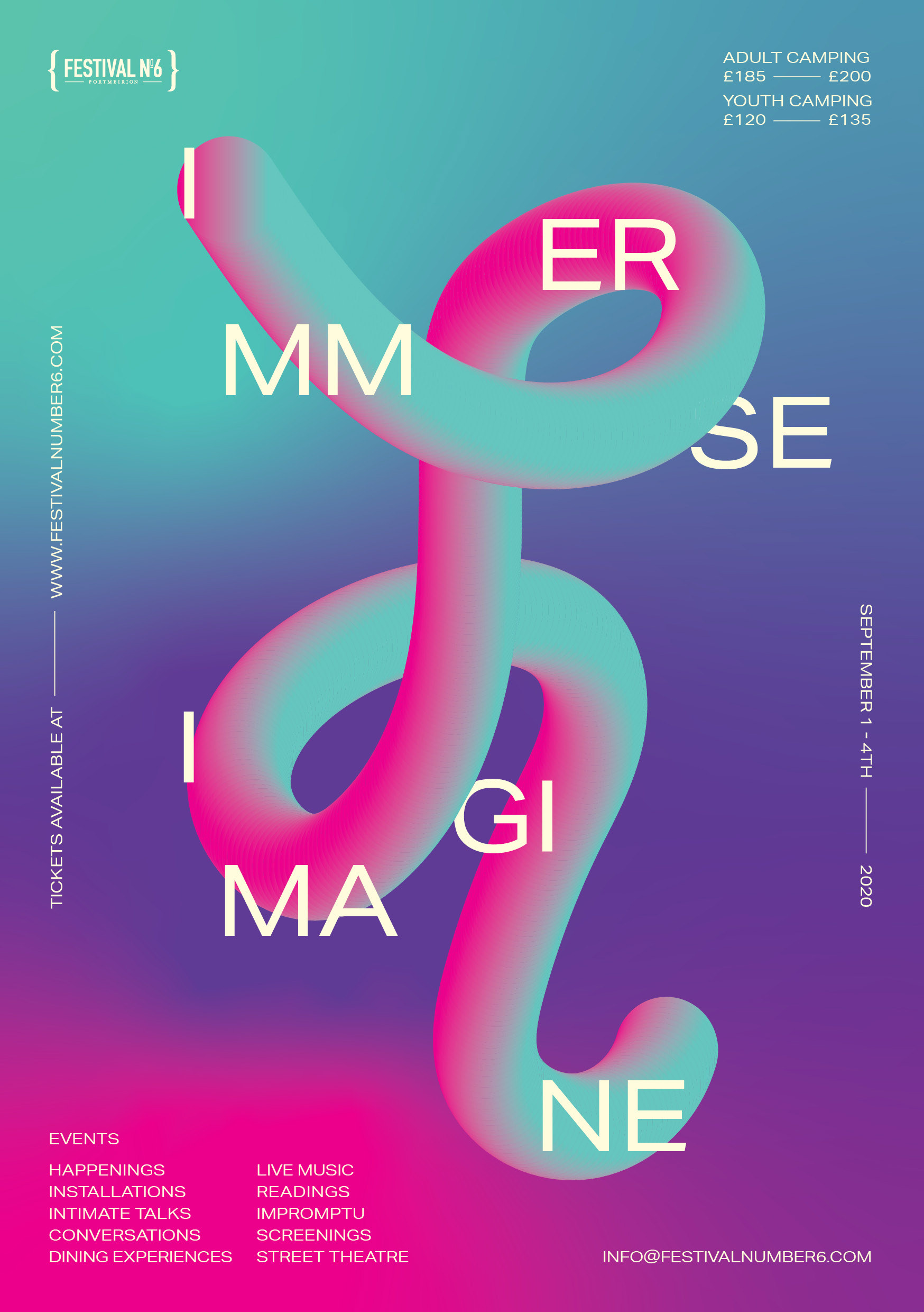
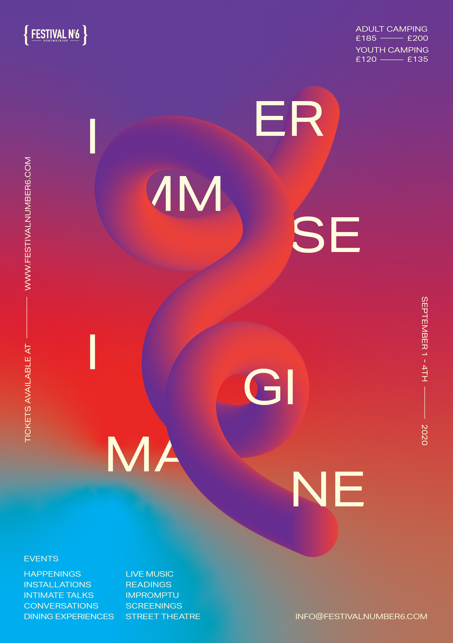
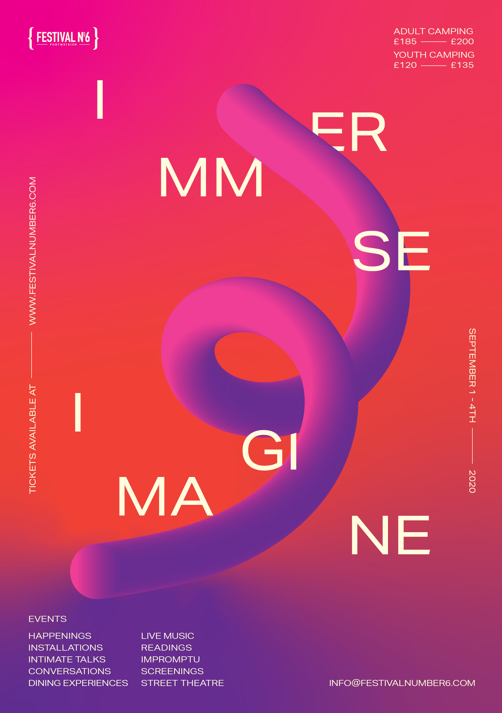
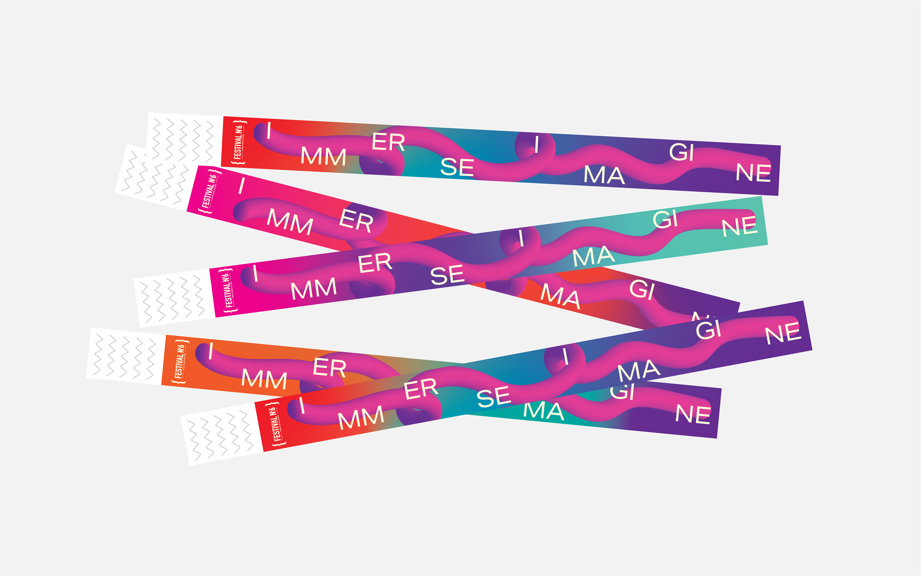
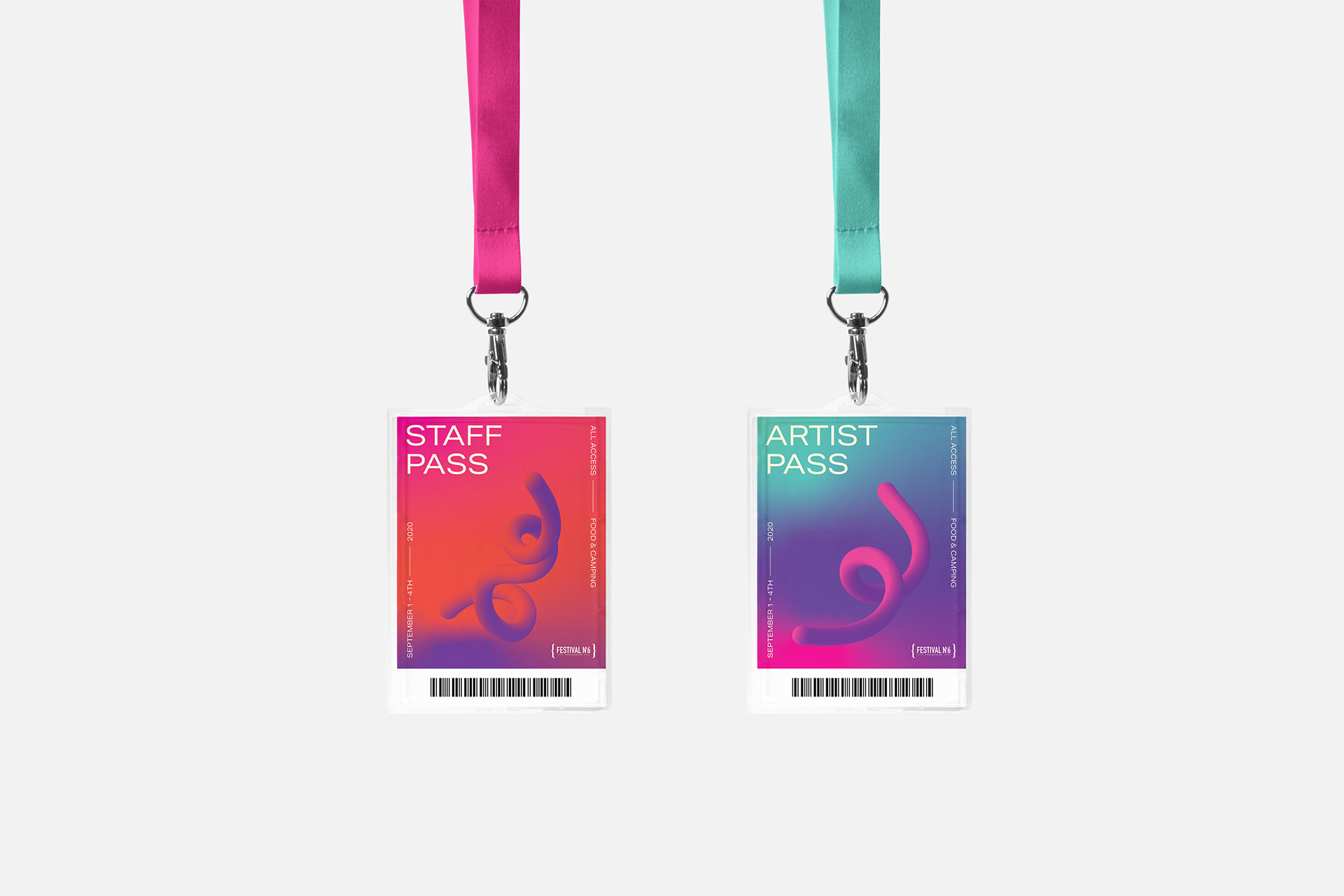
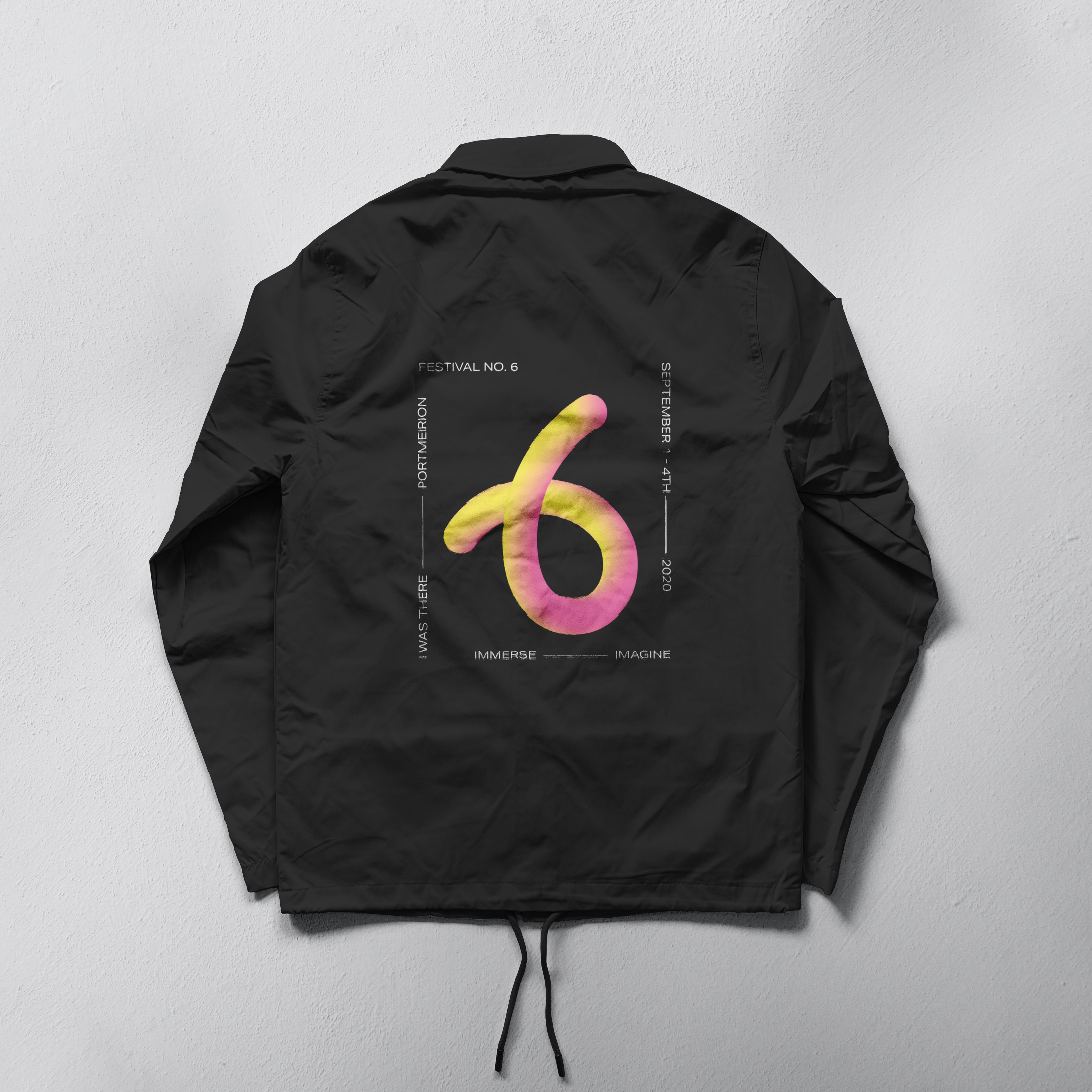
For this project, I was asked to create a visual identity for a music and art festival. The festival’s central theme, ‘Immerse and Imagine’, became the foundation of my design concept. As you’ll notice, a squiggly line is used throughout as the main graphic element. This line symbolizes the range of emotions people experience during festivals like this, an escape from reality where attendees can leave their worries behind for a three-day weekend of freedom.
For this project, I was asked to create a visual identity for a music and art festival. The festival’s central theme, ‘Immerse and Imagine’, became the foundation of my design concept. As you’ll notice, a squiggly line is used throughout as the main graphic element. This line symbolizes the range of emotions people experience during festivals like this, an escape from reality where attendees can leave their worries behind for a three-day weekend of freedom.
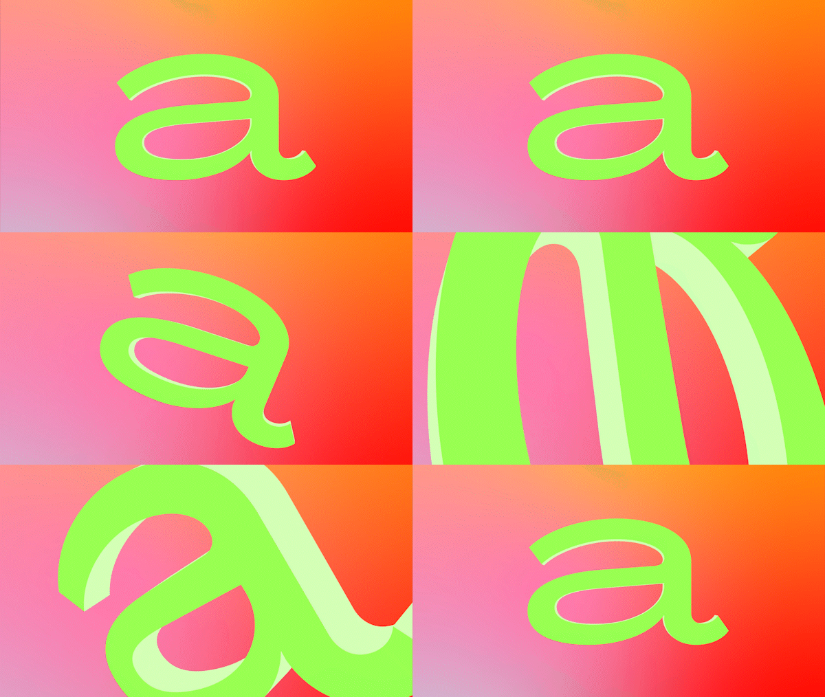
The line represents emotional and mental liberation, unbound by the strict rules of daily life. It flows freely, changing direction unpredictably, much like the mood and spirit of the festival itself. This sense of freedom and fluidity is at the heart of the visual identity.
Brief
How do we create a visual identity for a boutique art and music festival, to generate excitement?
Scope
Concept Development / Print / Webdesign / Merchandise
Client
Festival No. 6*
Date
December 2020
*concept work for a student project
How do we create a visual identity for a boutique art and music festival, to generate excitement?
Scope
Concept Development / Print / Webdesign / Merchandise
Client
Festival No. 6*
Date
December 2020
*concept work for a student project
